EM or REM? Scaling with font size
This may be an old trick, but we'll go through some tips when to use rem and em to ease your life as a frontend engineer.
EM or REM?

TL;DR
- Use only
emforfont-size. - Use
emformarginorpaddingif it scales withfont-size. - Use
remformarginorpaddingotherwise.
EM all the way for font-size!
em scales based on the closest font-size. By default, the font-size of the html element for browsers is 16px. With this, let’s see the below example on how em inherits the values.
Two things to notice here.
-
The
<p>element with 24px has itsfont-sizeinherited from its parent which is 1.5em. The<p>element with 36px again has afont-sizeof 1.5em, but this time its value is based off its parent’sfont-sizewhich has already be computed as 24px. -
The
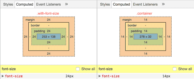
.containerelement has itsmarginandpaddingset to1em. The image below shows the box model of the element. Notice that themarginandpaddingare computed as 24px instead of 16px, due to the fact thatemscales relatively to the closestfont-size.

When to use REM?
Now that we have understood the effects of inheritance using em, there will be situations where it backstabs you.

rem to the rescue! rem aka Root EM calculated its value using the root font-size which is set at html, or 16px by default. This is useful when you don’t want your sizes to be scale off the closest font-size.
Another situtation where I find rem useful is when I’m implementing Material Design. In MD, many of the keylines are in rhythm of 8dp, which is 0.5rem on default browser behaviour. I can easily add 0.5rem to achieve the look and feel that I wanted (not that I can’t do multiplies of 8 😝).
To recite
- Use only em on
font-size. - If you want to scale with
font-size, example, to increase spaces around a text when thefont-sizeincreases, use em. - Use rem otherwise.